Age Verification
This website contains age-restricted material including nudity and explicit content. By entering, you confirm being at least 18 years old or the age of majority in the jurisdiction you are accessing the website from.
Our parental controls page explains how you can easily block access to this site.
0
iStripper 2.0 - reveal #1 : General look and feel Forum / Wszystko o iStripper
June 20, 2024
The release of iStripper 2 Beta is getting closer and closer and I went on a spy mission to bring you a preview of some of its new features.... [emoji detective]
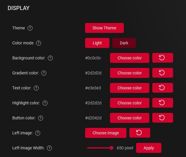
First, its general look and feel! 🥁
Not only the DARK mode is ready but we have also designed a complete customization section in the advanced settings to allow you to chose the background/text/button/highlight colors, select a left image and its size and even set a gradient of your background.
--> You will be able to design your iStripper interface exactly as you wish for a very unique result!
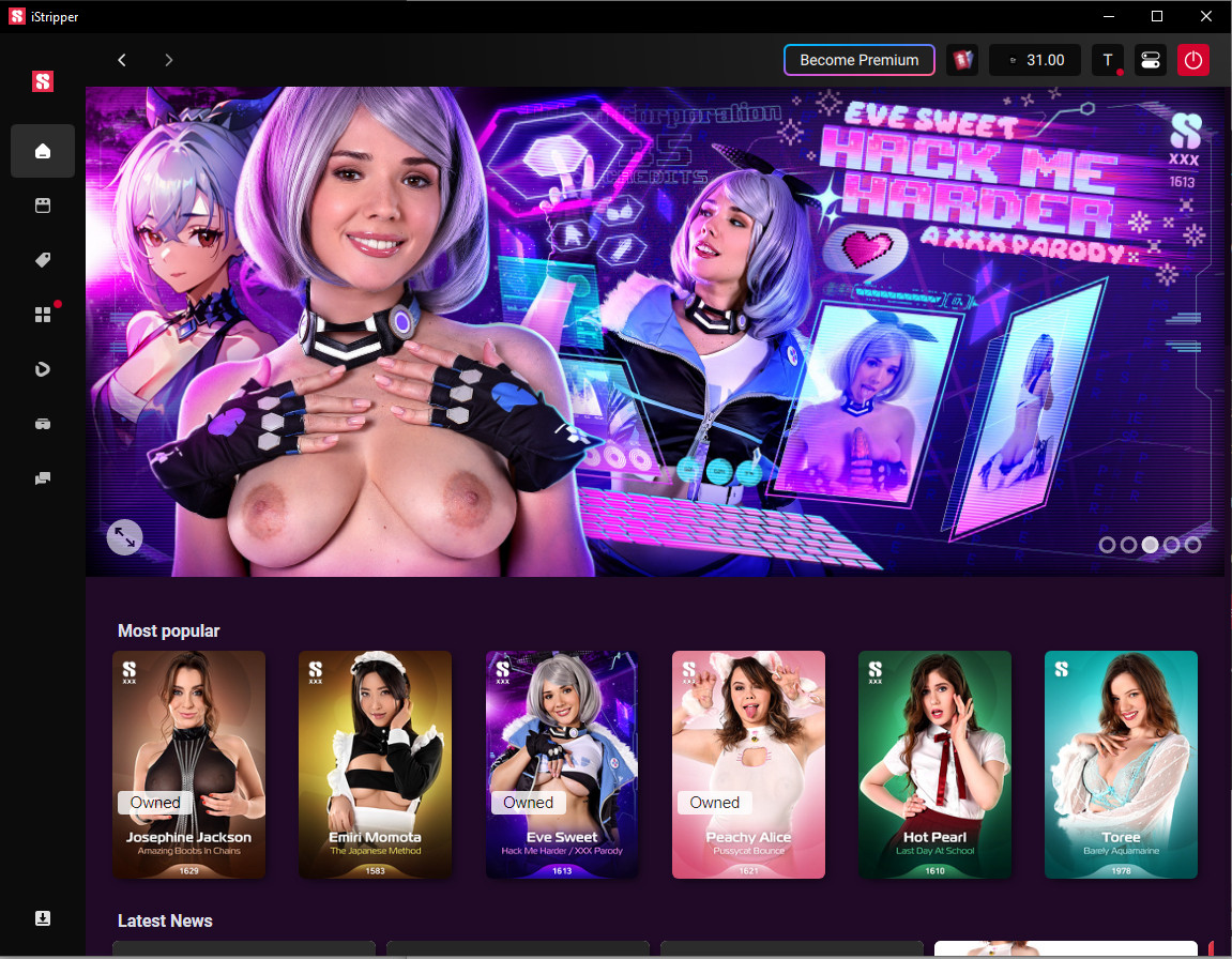
The different CONTROLS have been REORGANIZED.
The menu is now vertical left, the download icon at bottom left, your count of gift & joker cards now at top right near your credits count.
--> Way easier for you to manage it all!
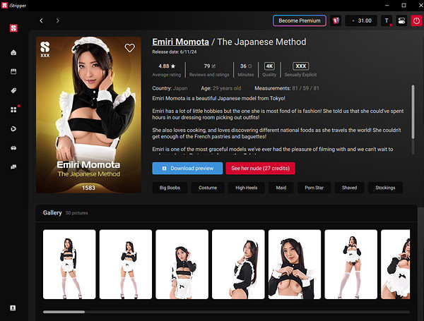
No more click click click! The DETAIL PAGE is now "ALL IN ONE"!
The card size has been increased for a greater eye catch!
A simple scroll will give you access to the photo gallery, comments, videos, and her other cards!
--> Easy and fast overview of all the show's content!
Last but not least, on the store and in your collection, most of the ACTIONS you can do on a show will be accessible from a simple RIGHT CLICK! Add to wishlist, download preview, add to your collection, add to your favorite or to a playlist...... but shhhh, this is another story!
--> Stay tuned for Reveal #2😋
**non-contractual screenshots, functions likely to evolve further
First, its general look and feel! 🥁
Not only the DARK mode is ready but we have also designed a complete customization section in the advanced settings to allow you to chose the background/text/button/highlight colors, select a left image and its size and even set a gradient of your background.
--> You will be able to design your iStripper interface exactly as you wish for a very unique result!
The different CONTROLS have been REORGANIZED.
The menu is now vertical left, the download icon at bottom left, your count of gift & joker cards now at top right near your credits count.
--> Way easier for you to manage it all!
No more click click click! The DETAIL PAGE is now "ALL IN ONE"!
The card size has been increased for a greater eye catch!
A simple scroll will give you access to the photo gallery, comments, videos, and her other cards!
--> Easy and fast overview of all the show's content!
Last but not least, on the store and in your collection, most of the ACTIONS you can do on a show will be accessible from a simple RIGHT CLICK! Add to wishlist, download preview, add to your collection, add to your favorite or to a playlist...... but shhhh, this is another story!
--> Stay tuned for Reveal #2
**non-contractual screenshots, functions likely to evolve further
Jenkers
Dołączył: Jun 2013 6 post(y/ów)
June 20, 2024
Neat! Will we be able to view our iStripper purchases on the iStripper 2 app?
Captain15
Dołączył: May 2015 30 post(y/ów)
June 20, 2024
This looks promising. I really like the customization options, especially with the left image.
ajmsnocomment
Dołączył: Sep 2008 7 post(y/ów)
June 20, 2024
Will the option be available to have the names of the main menu items, rather than having to take a guess based on stylised icons, if it's being ***** into a vertical band rather than horizontal?
June 20, 2024
Will the option be available to have the names of the main menu items, rather than having to take a guess based on stylised icons, if it's being ***** into a vertical band rather than horizontal?
In the current Experimental version this is dependent on the width of the App window.
Below a certain width it is icons only. Above that width it is Icons and Text.
I don't know the exact values required for the width. On a 4k monitor with Windows scaling at 150% it appears to be about 60% of the screen width. Below that = Icons Only. Above that = Icons & Text. This may change before the Beta is released.
Alkasyn
Dołączył: Apr 2008 754 post(y/ów)
June 20, 2024
Looks interesting, thanks for sharing
fallen0ne
Dołączył: Sep 2007 199 post(y/ów)
June 20, 2024
!No more click click click! The DETAIL PAGE is now "ALL IN ONE"!The card size has been increased for a greater eye catch!A simple scroll will give you access to the photo gallery, comments, videos, and her other cards!--> Easy and fast overview of all the show's content!
@Celine Thank you for sharing. The new version of iStripper looks good.
Can we please get an option to minimize the photo gallery, comments, videos, and other cards... for members who want to keep the model page clean and lite (like the current version of the software). The new model page can feel a bit overwhelming.
HansSachs
Dołączył: Mar 2016 1010 post(y/ów)
June 20, 2024 (edited)
I am ok with the possibility of customization but I don't like the new detail page at all.
I would like to stay to the old one if possible... moreover, I am particularly unhappy about the removal of the big pic of model standing up on the left.
I would like to stay to the old one if possible... moreover, I am particularly unhappy about the removal of the big pic of model standing up on the left.
NoseyJoe
Dołączył: Apr 2019 23 post(y/ów)
June 20, 2024
I am particularly unhappy about the removal of the big pic of model standing up on the left.
The big pic is sometimes included in the photo set, but it seems to me that most of the time the big pic is similar to a pic in the photo set but not exactly the same. Can we hope for an extra pic in the photo set if the big pic is removed? :)
HansSachs
Dołączył: Mar 2016 1010 post(y/ów)
June 21, 2024 (edited)
Can we hope for an extra pic in the photo set if the big pic is removed? :)Sincerly I dare to hope the beautiful big pics to be reinstated as they would deserve... personally I see them as a sort of summary of shows much useful and much appreciated - even more important to me than the actual "card" pic bearing model name and show number.
hansmyr
Dołączył: Mar 2017 2 post(y/ów)
June 21, 2024
oh wow thank you! i really waited for the customization setting stuff. And great looking reorganisation and overview.👌
aL0T
Dołączył: Apr 2016 307 post(y/ów)
June 21, 2024
I'm loving the dark mode! Thanks for the update!
✌ 💚 😎
June 21, 2024
Sincerly I dare to hope the beautiful big pics to be reinstated as they would deserve... personally I see them as a sort of summary of shows much useful and much appreciated
I agree with @HansSachs. I like the full-length photo for each card, as well. That is the easiest way to remind myself of which card is which. Sometimes the card image is not enough to differentiate which card has which outfit.
I do like the dark mode and the custom color settings. I've done a couple of themes for myself just so I can change the colors. I find the current default theme much too bright.
I'm looking forward to seeing more!
Socialhazard
Dołączył: Nov 2020 1168 post(y/ów)
June 21, 2024
Sounds good.👍 😎
Backwood
Dołączył: Dec 2023 3 post(y/ów)
June 21, 2024
Looks good! I like what you're doing!
Amelly
Dołączył: Jan 2008 388 post(y/ów)
June 21, 2024
Beau travail @Celine, vous aurez (encore) une boite de (bons) chocolats pour commencer la nouvelle *****ée 2025 😎
HansSachs
Dołączył: Mar 2016 1010 post(y/ów)
June 21, 2024 (edited)
I agree with @HansSachs. I like the full-length photo for each card, as well. That is the easiest way to remind myself of which card is which. Sometimes the card image is not enough to differentiate which card has which outfit.I think on new program could be implemented a "nostalgia" option reinstating at least the old detail pages for people who do prefere them.
UnicornPrincess
Dołączył: May 2023 7 post(y/ów)
June 21, 2024
i can't wait, i love it so much!
ColaAluka
Dołączył: Jul 2022 14 post(y/ów)
June 21, 2024
I am ok with the possibility of customization but I don't like the new detail page at all. I would like to stay to the old one if possible... moreover, I am particularly unhappy about the removal of the big pic of model standing up on the left.agree
Captain15
Dołączył: May 2015 30 post(y/ów)
June 21, 2024
Oh, I thought the customizable left image was the full body image. In that case I take back what I said. If the big left image is still there and customizable then that would be great. Would love to have a full frontal nude option for each one.
goodwolf
Dołączył: May 2011 300 post(y/ów)
June 21, 2024
If the goal was to get less clicks, then the biggest point missed: A button of a small +/- which changes the size of the one lady actually playing on screen by +/- 5 or 10 % each clicks. (just fullsize mode) This has been suggested far too many times (okay not as much as to bring back the favourite button, but still). Two little buttons would fit anywhere on the screen. Very difficult to always jump into the settings and also the scale is far too sensitive, one micron above or under the setting line does nothing just an accurate hit. Standing clip usually max. 110% size then comes a taskbar clip, when often 150% or even more is still good, then comes a standing or pole clip again, etc. It would (have been) be a very useful set of those two small buttons.
I also agree, that if the card would load the pictures set straight and always (not on separate tab as it always was): this will cause plenty of unneccessary Internet traffic. System will always have to wait to download those images, server is already not too quick and this will result or might result, that you can't even use the software without Internet connection. To be reconsidered but seriously !
I also agree, that if the card would load the pictures set straight and always (not on separate tab as it always was): this will cause plenty of unneccessary Internet traffic. System will always have to wait to download those images, server is already not too quick and this will result or might result, that you can't even use the software without Internet connection. To be reconsidered but seriously !
johnnywoo2015
Dołączył: Mar 2018 5 post(y/ów)
June 21, 2024
Great, we have dark mode after years of waiting.😀
HansSachs
Dołączył: Mar 2016 1010 post(y/ów)
June 22, 2024
PS: I strongly hope this Forum not to be dismissed on the new version...
June 22, 2024 (edited)
PS: I strongly hope this Forum not to be dismissed on the new version...
Currently, in the experimental version, the Forum appears to be identical to the "stable" version. I cannot see any obvious changes to it.
Of course that could change in the future but currently it is fine.
PS
I have actually used it to post this.
evilbeaver
Dołączył: Feb 2009 1 post(y/ów)
June 23, 2024
Looks cool. More multi girl full screen options would be nice.
wait05
Dołączył: Jun 2019 18 post(y/ów)
June 23, 2024
If the goal was to get less clicks, then the biggest point missed: A button of a small +/- which changes the size of the one lady actually playing on screen by +/- 5 or 10 % each clicks. (just fullsize mode) This has been suggested far too many times (okay not as much as to bring back the favourite button, but still). Two little buttons would fit anywhere on the screen. Very difficult to always jump into the settings and also the scale is far too sensitive, one micron above or under the setting line does nothing just an accurate hit. Standing clip usually max. 110% size then comes a taskbar clip, when often 150% or even more is still good, then comes a standing or pole clip again, etc. It would (have been) be a very useful set of those two small buttons.I also agree, that if the card would load the pictures set straight and always (not on separate tab as it always was): this will cause plenty of unneccessary Internet traffic. System will always have to wait to download those images, server is already not too quick and this will result or might result, that you can't even use the software without Internet connection. To be reconsidered but seriously !ya, i also hope have option to customize size without open setting, quite annoying that everytime i mannually adjust it haha.
Brak spełnionych wymagań by wziąć udział w dyskusji.
Jako darmowy użytkownik programu iStripper, nie możesz odpisywać w tematach na forum ani tworzyć nowych tematów.
Masz jednak dostęp do podstawowych kategorii dzięki którym możesz pozostawać w kontakcie ze społecznością !